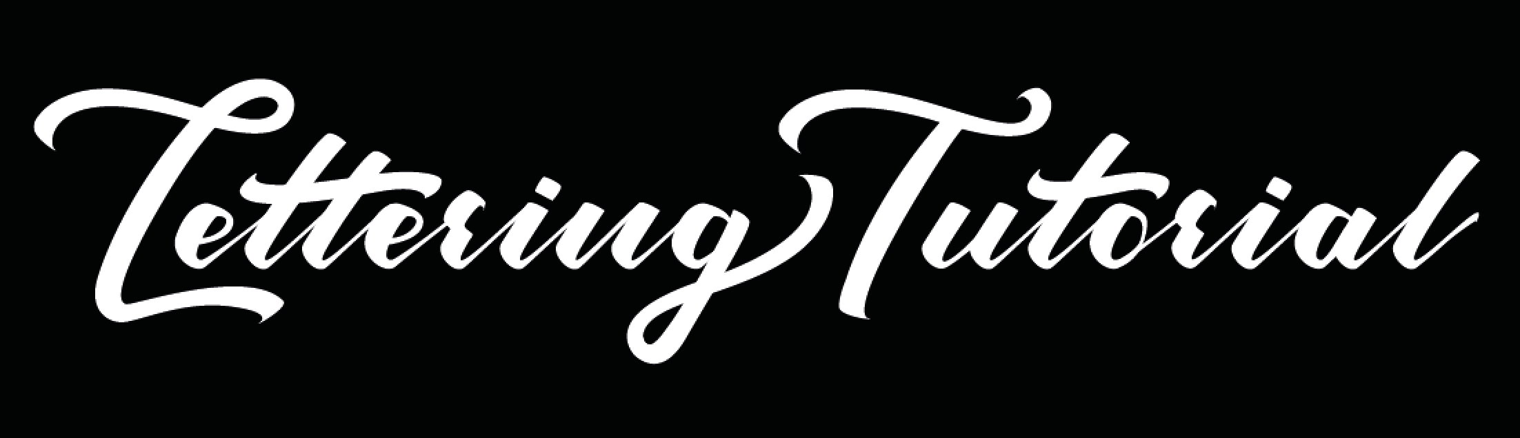
![]() Very recently Lettering Tutorial got a new look and that included a new logo too. The original logo was all digitally generated, using an existing font, and basic shapes that I tweaked in Photoshop. I put the original logo together quite quickly as I was keen to focus on content for Lettering Tutorial. It’s now six months down the line, and I thought it was time for a new hand lettered logo seeing as Lettering Tutorial is all about hand lettering.
Very recently Lettering Tutorial got a new look and that included a new logo too. The original logo was all digitally generated, using an existing font, and basic shapes that I tweaked in Photoshop. I put the original logo together quite quickly as I was keen to focus on content for Lettering Tutorial. It’s now six months down the line, and I thought it was time for a new hand lettered logo seeing as Lettering Tutorial is all about hand lettering.
First Drafts
The new logo began life as just a rough sketch, along with four other potential designs. I drew the rough designs out, taking inspiration from styles of lettering that I liked, whilst trying to keep the designs simple at the same time. I didn’t want to overcomplicate the logo designs as logos are supposed to be clear, memorable, and easy to read. After drawing out the five designs I discovered I had preferences towards numbers, 2, 3 and 5.

I only needed one design to move forward with, so I decided to share the designs in a Facebook group I help to manage, Hand Lettering HQ. I also shared the designs on the Lettering Tutorial Facebook page, and asked for opinions and favourites. The logo wasn’t intended for just me, as Lettering Tutorial is there to help and inspire anyone interested in lettering. A fantastic amount voted, and over 85% chose design 5.
As so many voted for design 5, I didn’t need to debate any further on which design to take forward.
Refinements
After this first initial stage, I traced out design 5, and started to refine some of the shapes of the letters. It didn’t take me too long to realise that because the spacing and proportions of the rough sketch were not great, I was starting to overlap letters. To resolve this, I drafted up the words ‘Lettering’ and ‘Tutorial’ on two separate sheets of grid paper. Tracing, drawing out and refining one letter at a time, to try and get even spacing and even letter sizes. I chose to use grid paper as I knew it would help to keep my lettering in a straight line, and the letters similar sizes by counting the amount of squares in the grids.

One of the first adjustments I made was developing the letter ‘L’, so it would look stronger and could be clearly read as an ‘L’. A voter in the Facebook group mentioned that the ‘l’ in the first rough sketch might not be defined enough. When I looked at the sketch again, I realised they were right, so I knew I needed to do something. This is why it is important to share your work. I’ve written an article all about sharing your work, but to summarise a small part of that article, sharing can help you to develop as you will often get feedback. Maybe if I hadn’t shared the logo and developed it with just my own input, I would have still got to a point where I realised the ‘L’ needed to be stronger. Maybe I wouldn’t have got there though, and the new logo you’d be looking at on Lettering Tutorial would have a weedy ‘l’.

In all honesty throughout this stage I should have used lots of sheets of tracing paper, to keep refining the shape, weight, and angle of letters. However I took an erase it, redraw it, erase it, redraw it approach. So I just kept working the same sheet of paper until I got it right. This can be risky, as you may draw something out, then decide to change it, and the change might not be for the best. You might then struggle to get your lettering back to how it was before. If you work on tracing paper though, and just keep tracing a new copy each time you make major refinements, there’s never any risk of loosing anything great.
Inking
Once I had drawn both ‘Lettering’ and ‘Tutorial’ out separately, and had them looking mostly how I wanted, I traced the two hand lettered words together onto a plain piece of paper. Whilst tracing I worked on perfecting angles, and spacing just a little further, as they still weren’t quite right previously. I outlined my tracing with a hard pencil to give a dark outline, this was so I knew a copier would pick most of the outline up. I printed out a few copies of the outline so I could then ink it in. If I’d just inked the pencil outline in, I would’ve needed to redraw it if I messed up the inking, or if I wanted to experiment a bit further at the inking stage. My plan was to play about a bit with inking the outline in, making the joining lines of the letters a bit thicker, so printing out multiple copies and then working on top of those was a good plan.

Digitisation
By inking the outline in I was able to spot any areas that still needed further refining. Seeing letter shapes filled in gives a different contrast on the paper to letters just being outlined. With the inking done, it seemed like a good time to move onto digitising the logo. I took photos with my phone of the lettering, sent the pictures to my computer, then opened the clearest one in Adobe Illustrator. I used the live trace tool followed by clicking on expand, to trace the lettering and allow me to click on individual letters to move them around. I selected all of ‘Tutorial’ and then dragged it up next to ‘Lettering’ as it was still hanging out below. The lettering needed to be level, so I enabled rulers and then dragged guides onto my Illustrator art-board. Placing one along the baseline of ‘Lettering’, and one along the x-height. ‘Tutorial’ then got dragged up and moved slightly so it was spaced nicely next to ‘Lettering’ and perfectly level with it. To my dismay I noticed that the ‘i’, ‘a’, and ‘l’ of ‘Tutorial’ were sloping down over the line. Even though I’d been very careful when tracing the letters from the grid paper, and had drawn out a baseline, I must have still managed to move the paper whilst tracing.

After staring at my screen for about ten minutes, I concluded that the capital ‘L’ of ‘Lettering, and capital ‘T’ of ‘Tutorial’ were still not quite looking how I wanted them to, when put together. Up until this point I had only seen them sat on separate lines, they just looked a little off. Out came my paper again, I put it on top of the inked page and used a brush pen this time to trace the capital ‘L’ and ‘T’. I decided on using a brush pen rather than just drawing out the lettering again, as I thought it would provide a more natural flow with any curves. Brush strokes would also provide a more accurate idea of where thick and thin lines would appear. I tidied my brush strokes up using a micron fine line pen so my letters didn’t have any jagged edges, then picked the letters that I thought looked best and moved them both into Illustrator.

Vectoring
Vectoring is always something I’ve struggled with in the past. However thanks to tips from Skillshare classes by both Matt Vergotis and Scott Biersack, it finally clicked when it came to vectorising the Lettering Tutorial logo. I could have just left the logo as it was after live tracing it, and switching out the capital letters for the new ones I’d brushed. I could have taken it into Photoshop changed the colour, and then used it as the logo in it’s raw form. As it wasn’t straight at the end of ‘Tutorial’ though, and as all other elements of the websites new look were sharp and crisp, I decided vectoring the logo would work best. That way I’d still get the hand drawn features by just vectoring around what I had on my screen, but with a smooth edge instead of a jagged one.
It took me a few hours to perfect all of my anchor points and curves, but I finally had a vectored outline. I switched the outline to fill instead, then moved the logo into Photoshop to create the files I needed for the logo.

Pencil Icon
I also created the little round pencil icon that I now use at the bottom of the site, and as the profile picture across all of the Lettering Tutorial social media accounts. I drew out the pencil, brush pen, calligraphy pen, ruler and eraser. Then again took a photo and moved it into Illustrator, vectoring over the rough outlines. After I was done with Illustrator, I moved each vector into Photoshop, adjusted the layout along with the colours until I had the pencil icon.

Wrapping Things Up
I hope this has provided a good insight into my working process, and also armed you with a few lettering tips. Everybody has a workflow that will be slightly different to somebody else’s, it’s all about experimentation. If you practice often enough and try new techniques, you’ll find a good workflow suited to you.
